(Clear Page Focus) The purpose of this page is meant to compare the amoutn of patients depending on their Admission Types, Blood Types, and Medications. I am trying to identify which set of age groups uses or is part of something more than the other, lookign at basic comparisons.
Patient Admission Data
| Admission Type | Average Age | Lowest Age | Highest Age | Number of Patients |
|---|---|---|---|---|
| Elective | 51.433 | 18 | 85 | 873 |
| Emergency | 52.5074 | 18 | 85 | 877 |
| Urgent | 52.6608 | 18 | 85 | 858 |
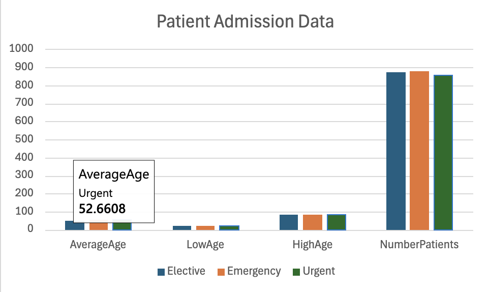
Analysis/Argument/Knowledge:
Based on the Patient Admission Data CHART, you can make the arguement/analysis that for those admitted in Elective, there is less than patients admitted into Emergency and Urgent.
Blood Type Patient Data
| Blood Type | Average Age | Lowest Age | Highest Age | Number of Patients |
|---|---|---|---|---|
| A+ | 53.1424 | 18 | 85 | 344 |
| A- | 51.4125 | 18 | 85 | 320 |
| AB+ | 51.1487 | 18 | 85 | 316 |
| AB- | 53.9564 | 18 | 85 | 344 |
| B+ | 51.5047 | 18 | 85 | 319 |
| B- | 51.6994 | 18 | 85 | 316 |
| O+ | 52.468 | 18 | 85 | 344 |
| O- | 52 | 18 | 85 | 305 |
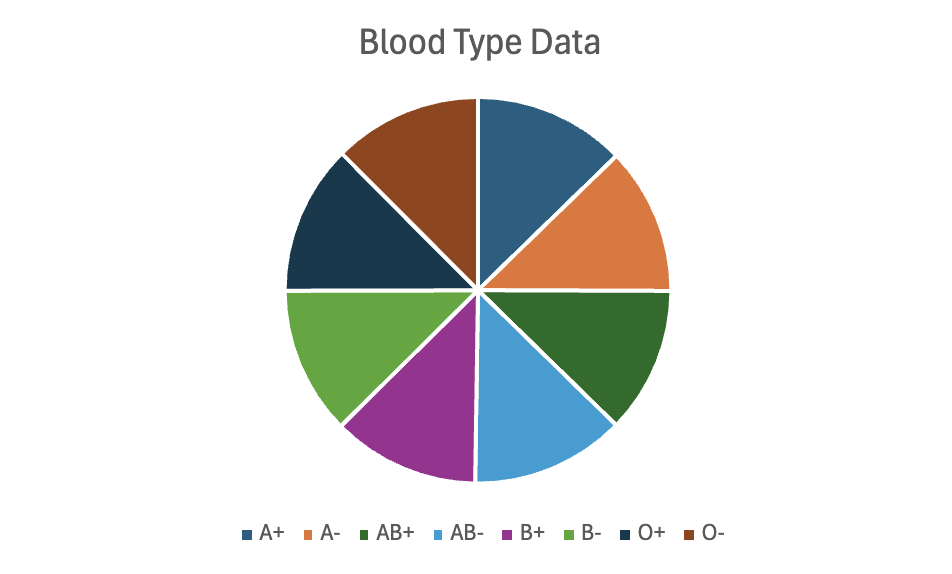
Analysis/Argument/Knowledge:
Based on the chart, you can see that there is an equal amount of patients across the board on all Blood Types.
While of course there are small value differences on the table, in the chart the averag eis spread across evenly. So in conclusion you can make the arguement that there is an equal set of patients per blood type in among the data set no matter the condition or anythign else.
Medication Type Data
| Medication | Average Age | Lowest Age | Highest Age | Number of Patients |
|---|---|---|---|---|
| Aspirin | 54.3006 | 18 | 85 | 509 |
| Ibuprofen | 51.1892 | 18 | 85 | 555 |
| Lipitor | 53.5234 | 18 | 85 | 512 |
| Paracetamol | 51.1642 | 18 | 85 | 481 |
| Penicillin | 50.9437 | 18 | 85 | 551 |
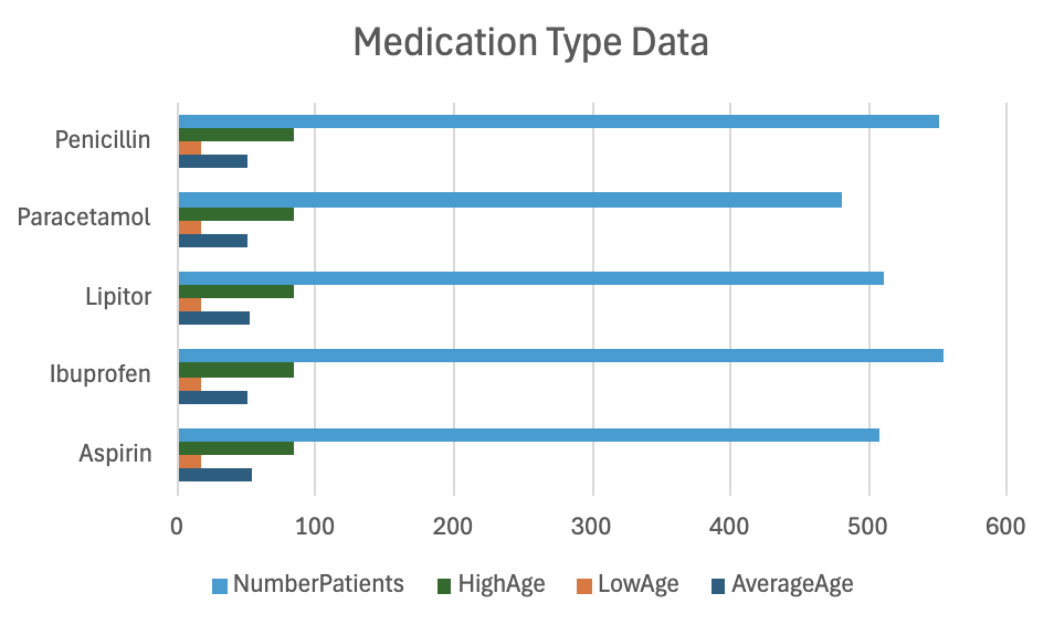
Analysis/Argument/Knowledge:
Based on the chart, you can make the arguement/analysis that there is an equal amount of patients for those receiving Penicillin AND Ibuprofen. There is a relatively less amount of patients who are treated/given Paracetamol, Lipitor, and Aspirin.